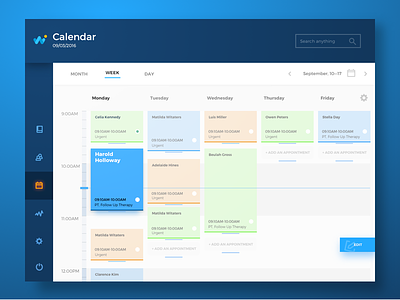
Health Care App
Hi dribbblers!
Today our shot is devoted to the theme of health care: we would like to present you several screens of the medical application. The app's target audience is primarily doctors and the key objective of this product is optimization of huge amount of data which doctors deal with on a regular basis. Every single piece of information about every patient is vital for making a right decision, so creating the interface designer was focused on making it organized, clear and easy-to-use. Intuitive navigation was set as the biggest priority to make the app applicable even for people with low or medium level of tech literacy. Next shots in the set will feature animated transitions and microinteractions.
To share more ideas we get working on design projects and concepts, we regularly update Tubik Blog with new articles. One of the latest is about problem-solving UI animation. Welcome to join!


