A refreshed Digital Pond
Over the last month we've been updating the branding of our Digital Pond meet up. We'll be posting a few shots on this over the next few weeks but first up is the logo.
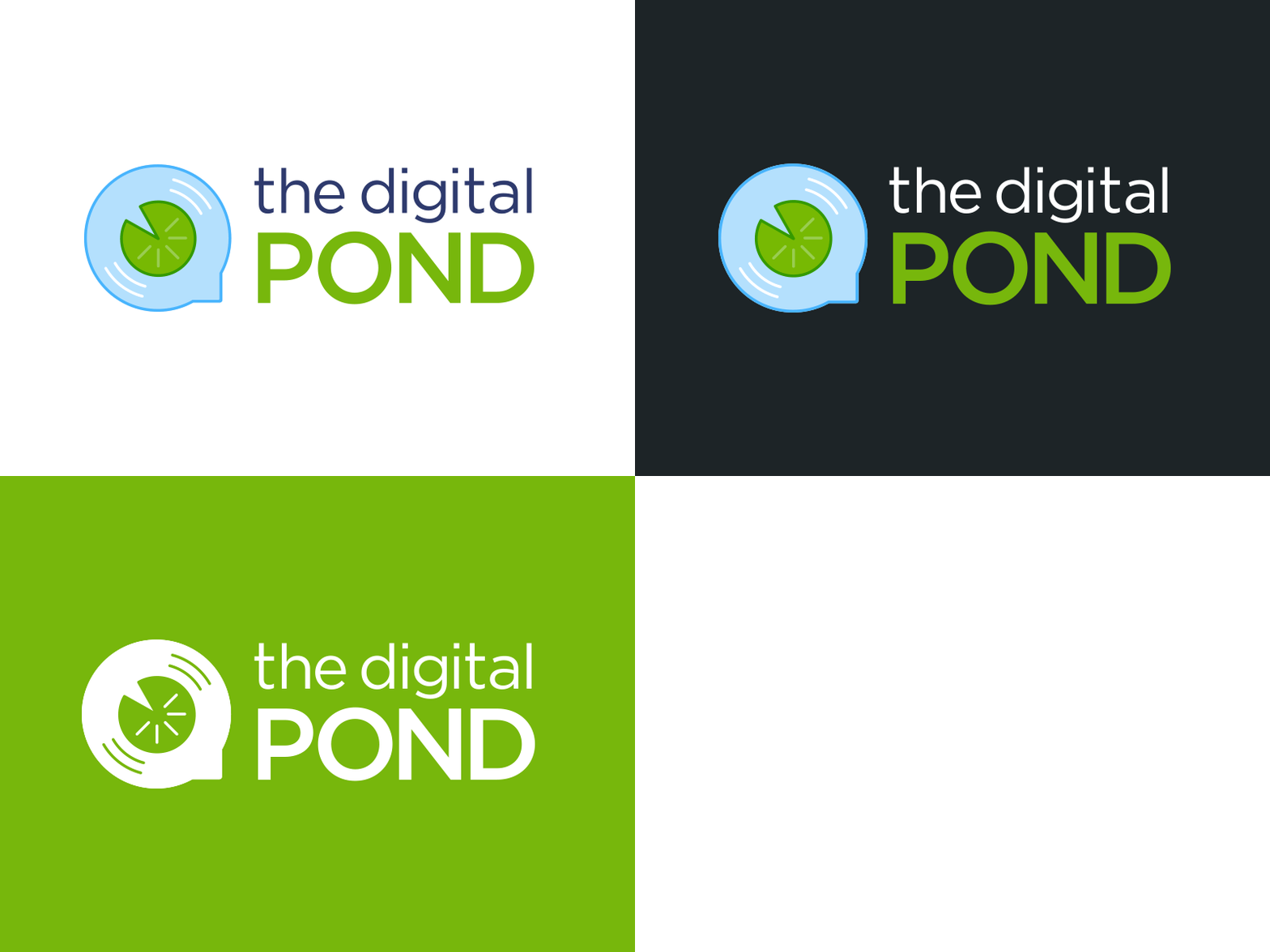
We kept things short and sweet by simplifying the logo mark while maintaining it's original look and feel. This allowed us to create different colour ways that would work on a multitude of coloured backgrounds (especially when designing collateral for each event).
We changed the logo type to Gotham. This subtly ties the logo and branding to our Cyber-Duck brand. The logo type was kerned to help maintain a similar length to the old logo. Finally we reduced the height of the logo type to balance out the weight of the logo mark and the type.
Keep an eye out for more posts on this as we dive into the new brand colours, shapes and photography in the coming weeks!
