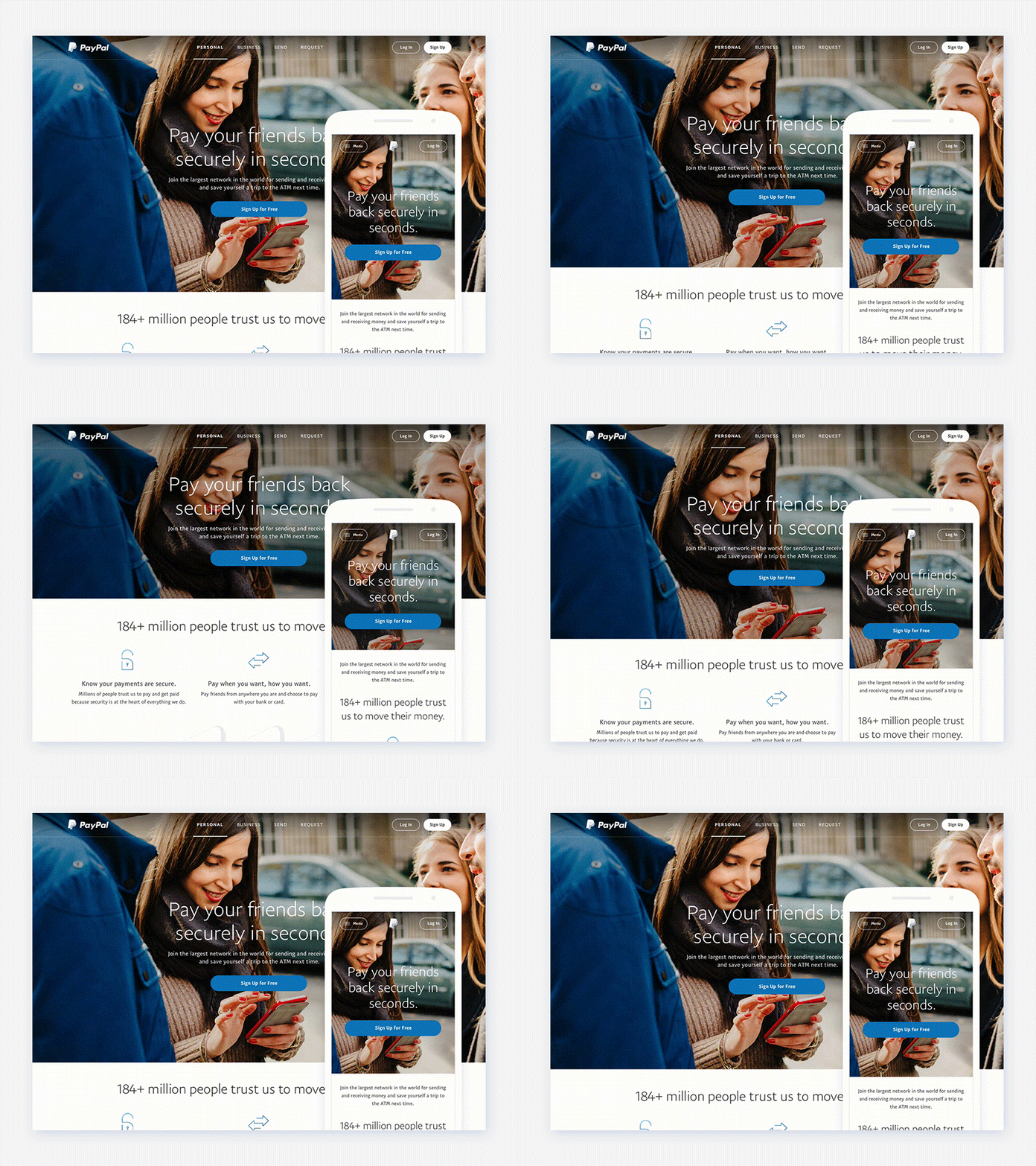
Homepage Hero Collapse
FEEDBACK NEEDED
Prospective customers hit the homepage of paypal.com and behave in a few ways. They either sign up immediately – because they've been researching PayPal already and they're now ready to commit, or they just want to dive in and figure out if it's the right solution by trying it out. Or, they are looking for more information which may or may not lead to signing up at some future time.
For people that are ready to commit we want to present a huge billboard that leads to Sign Up. For those that are looking for more information we want to encourage them to scroll and read the content further down the page.
This proposed solution pauses briefly on the "large billboard" state and then animates to collapse the hero and reveal some additional content. The motion (I hope) will catch users' attention and encourage them to continue consuming the page content.
So, the question is, for how many seconds should this initial state be shown before collapsing? Seven seconds? Ten seconds? We'll put this into a quick round of user testing but I'm interested in getting the opinion of other designers... What do you think?
