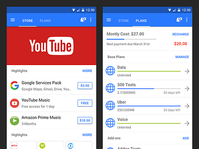
ItsON Consistent Top-nav Exploration Android
An Android to iOS consistency comparison I designed for an ItsON SaaS platform PM as part of an iteration sprint to figure out the navigation structure for this ItsON sales team client and ItsON's clients re-skinned apps.
Keeping in mind project goals/constraints, platform best practices, guidelines, I put together this hi-fi comp as one of the proposals for having similar but platform-tailored UX.
note: the drawer icon is reversed-style in the iOS attachment in order to allow for swipe-to-go-back compatibility.
More by 7 View profile
Like

