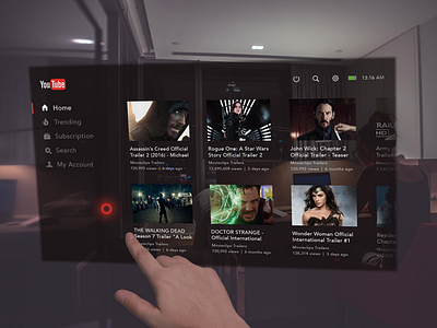
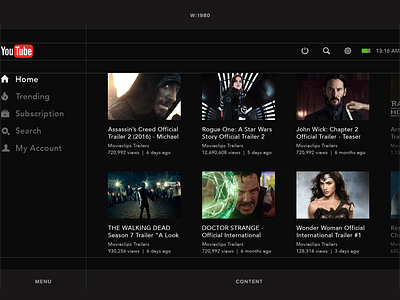
Youtube Application Concept for Hololens
What do you think about our AR/VR present and future? Recently I found myself drilling the subject. Let’s daydream together! This shot is the result of some insights.
Here are the principles I tried to follow:
- Resolution: for now the default and maximum supported resolution of the HoloLens is 720p or 1268x720 per eye, yet I used FullHD.
- Fonts: avoid slim and tiny fonts. Think about the distance for reading. In fact, this time, I just made all by sight but on the average, multiple standard values by 2.
- UI: active states and hovers are really important. I gonna explain that in the upcoming animated shot. Stay tuned!
- Navigation: interaction is based on a specific list of hand movements. To collapse or close the app you need to wave your hand or use active corners, holding them for a couple of seconds.
- Statusbar: it’s not clear for me enough whether it should be or not. In theory, it’s useful to see time and state of charge at any moment, especially during long Skype calls.
In the next shot I want to show the video how this UI could work. Also, I’ve got some ideas for other apps. Share your opinion on the most interesting stuff for now!
Follow us to keep in touch:
Behance | Twitter | Facebook | Instagram

