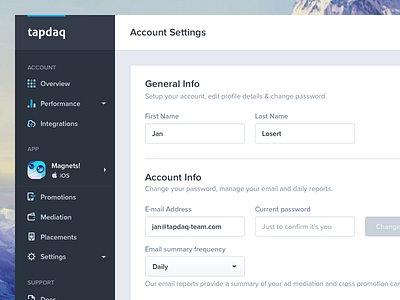
Tapdaq - Account Settings
500 Recommendations reached on "My Process article"! Thanks everyone for this huge support. So far the most highlighted part is my view of Dribbble being part of the UI/UX decision process. (Don't get it wrong, I love dribbble. Here is the highlight:
Leave dribbble behind
From what I’ve learned and how my designs have changed over past 4 years, I’ve got to the point where Dribbble is the best way for us designers to attract new clients and show off our work. But it’s not necessarily the place you want to create your designs for. I’ve always aimed to have nice pixels with sexy profile pictures, but that’s not what real users need and will use. This is one example from Tapdaq, something what I’ve designed with thinking of nice shot for Instagram and Dribbble and this is how the current screen looks after I’ve spend hours of watching people editing their profiles and after I’ve realized what info they actually request and need. You may receive 500 likes for bright crazy animation of a potato or sliding pizza but what’s really important is that your users will find how to manage frequency of company emails or how to filter their performance analytics.
On my shot attachment you can see the change of one of our Tapdaq screens.
Read full article - https://medium.com/sketch-app-sources/26-steps-of-product-dashboard-design-c97af84c4146#.nfjs2vwdr
--------------

