American Express Re-design
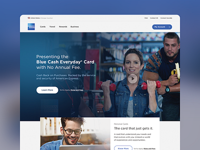
When we encountered American Express’ original homepage, we were bombarded with loaded elements, poor UI/UX, and overall visual fuzz. In this redesign, Loka imagined what the American Express homepage could be: a fresh, ad-oriented environment that is specifically tailored to the end-user.
This design grants the user access to the products they are most likely to purchase. The enhanced product selection has improved UI/UX elements that directs customers to products that will meet their needs. There’s also a friendly narrative element to the page -- yes, you’re having a conversation with a company, but it’s a friendly dialog. We wanted to enhance the Tina Fey effect!
More by Loka, Inc. View profile
Like

