Honeycomb Detail
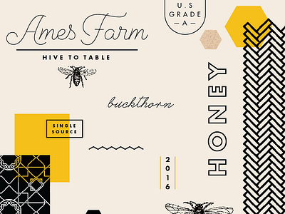

And third concept for the honeybee company. This one being focused on the detail and craftsmanship that go into the honeymaking process—and also reflective of the detail of the honeycomb pattern. It's where the process happens—parts working together, collaborating and making details that build something beautiful. Taking the natural element of honeycomb to use as a foundation, a library of geometric patterns will be developed. Using black and white patterning gives it a modern look that is crafted with precise detail. The variety of simple patterns will change out per flavor profile and floral source—an important element and differentiator in the brand and company. Natural papers and materials give it the authentic and handmade feel that it is. Elevating the honeymaking process and giving it a bit of a sophisticated look with the crafted patterning detail, gives this concept an artisanal look—yet one that is personable, friendly and light.
We're moving forward with this concept (with a few changes including bulking up/modernizing the Ames Farm logo type and adding a larger color palette—one that is more unexpected compared to the typical honey gold), along with this artistic one
Working on how the details will end up. I'll be working on some test labels to see how these identities will expand into their main application.