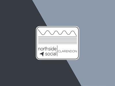
WIP: Northside Social Rebrand v2
I'm not sure I like this direction anymore, but I iterated and refined a bit to see if it would chance my opinion. In my opinion, the lines make the logo look a bit too noisy/cluttered.
I still want to rebrand this coffee shop, and I still like the palette I chose, but I think I will scrap this direction and scheme a new one.
What do you think?
More by StillUpMySleeve View profile
Like


