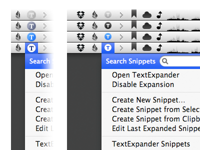
TextExpander Menu Bar Icon Update
I’ve been a satisfied customer of SmileOnMyMac’s TextExpander for years. However, I’ve never really been happy with the selection of icons for the menu item. They always felt too large in the context of the menubar and — quite frankly — a bit fuzzy looking.
This image shows the simplest variation of the three default icon sets on the left. My revised icons are on the right.
What do you think?
More by Grant Hutchinson View profile
Like
