Flexing the Grid
The gist: A small update went up this morning. Our large shot grid is now a bit more flexible.
The details: Our large shots render at 400px (450px with padding and margins). In some cases, the grid wasn’t utilizing the viewport as well as it could.
Here’s an example…
Let’s say your viewport was 1366px wide (full-screen on our fourth most popular viewport). The page has 30px margins on each side, meaning the shot grid had 1306px to work with. Previously, we would only show you two large shots with 203px of empty space on each side of the shots. Today, we show you three shots at 385px wide rather than 400px wide. It’s a small change, but one that can make a big difference if you happen to use Dribbble at one of the viewport sizes we optimized.
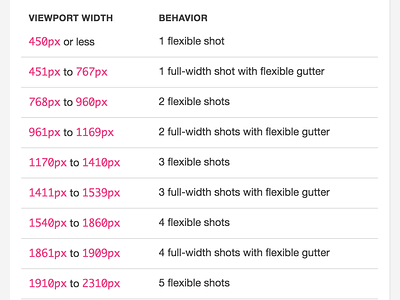
Shots will now render at 400px when we have the room, but can shrink down to 320px before the gutter appears on each side of the shot grid. I made the cutoff 320px because if you get much smaller than that, your large shots aren’t much bigger than your small shots. I’m tempted to drop that down a bit more so we can get three large shots on a full-width Macbook Pro viewport on our new Profile design, though. I’m curious if anyone has any opinions on this. We’re always looking to improve the shot grid since it is something so very vital to the Dribbble browsing experience.
The shot above is simply a screen grab from the internal style guide I’ve been chipping away at. Much of the grid is built on Sass variables and calculations, but I’ve also documented exactly what happens at each viewport size. The attachment displays a before and after version of the example above.

