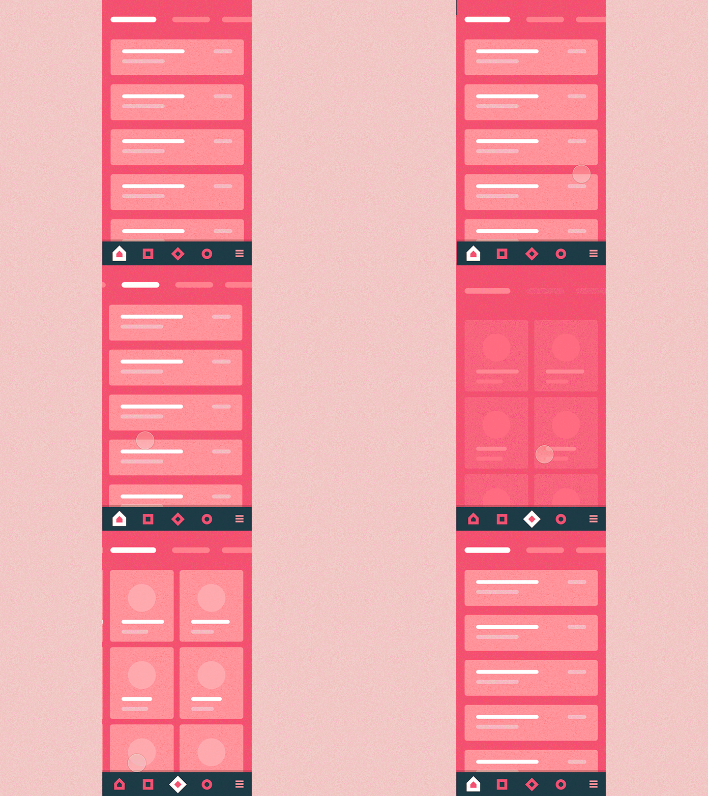
#8 Bottom Nav & Tabs
Hello players (and not only tho),
So this time i decided to take a look at tandem of a bottom navigation and upper tabs. This approach has certain advantages and, as i see it, primary one among them is accessibility.
You can have all your relatively complex navigation beneath your thumb and yet your focus is still left on the content.
This shot is being part of so called interaction library, launch of which's been announced at my previous post.
Interaction library would aim a few main targets: - Quick access to the example of a generic interaction you can quickly share with your client to get a reference point on the table; - It’s easy to select and implement a behaviour type that would be suitable for a particular project you work on, as i’ll try for them to serve a typical UX need; - I will as well try to cover the most interesting and non-standard approaches to explore relatively fresh behaviours so we all stay mainstreamed and aware; - I do love create nice and smooth interactions and so now i have a chance of doing that independently of the project i currently work on most of my time :)
P.s. Hope that is any interesting and hit "L" if you feel like it :)
