Your appearance (palette) is everything
It is funny to hear when designers have never used the Appearance Palette when working in Adobe Illustrator. When someone pointed it out to me years ago I was blown away and now I don’t know what I would do without it.
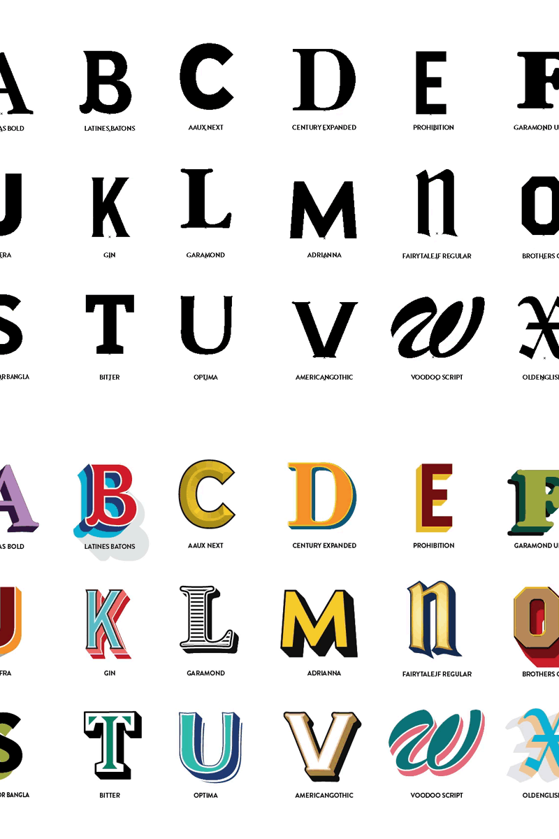
Here is a little personal thing I’ve been putting off for a while to build. Its just a lettering & effect sheet that I can reference when doing various sign & poster projects.
All of effects are done with a single object. That means no duplicating the "K" four times to get all the colors and strokes in there. Check out my attachments to see the appearance palette reference.
If you don't know about the appearance palette and have questions feel free to ping me! https://twitter.com/okayjeffrey
Note: A lot of these are not final styles they are starting points to save time on a project so then I can then modify the colors and other treatments to get to a final result.


