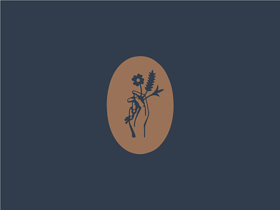
Common Kin logotype
Here's the final logotype for Common Kin Bakery. If you're in the Raleigh area, they'll be serving up some delicious cupcakes as the NC State Fair.
The condensed type up top is entirely custom. Similar to the previous logotype we've shared, this one still derives from vintage seed and vegetable catalogues but this time takes a less gothic approach. It was fun pairing it with Ridley Grotesk which is a tad wider than most sans and helps balance the type up top.
As always, more to come!