Logo Updates
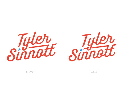
I made this logo while finishing up my senior year of school. It felt great at the time but looking back its incredibly unbalanced. The left version is my attempt at fixing that unbalance. Let me know what you guys think, or what I should tweak. ( I tried lining up the "T" with the "i" and it felt unbalanced again)