Matteo & Mullen, CPA's: Logo
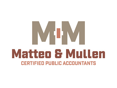
Color inspiration for this brand was drawn from the old historic brick building that houses Matteo and Mullen, CPA’s. The mark above the logo text features the first initial of each partner with a subtle plus sign using negative space to illustrate the partnership within the company.
The typeface is a sans serif industrial style, to match the geographical location of the office as well as give a professional and stable feel.
Photography was used to bring authenticity and a custom tailored feel to the website.
For more on this project visit: http://www.crescendodesignstudio.com/blog/2016/10/9/brand-development-matteo-mullen-cpas