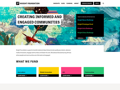
Knight Foundation Redesign
We recently finished up a year long project with Knight Foundation. A big shout out to @Nabil Kazerouni for his support throughout the whole thing.
Our design process began with a 2 month long in-depth research and discovery phase. We analyzed existing site behavior, dived deep into analytics, and conducted several interviews to focus our efforts on key user personas, their needs, and optimizing important user flows.
Across the entire site we maintained a strict color palette using a CMYK/RGB inspired color system. Structural elements and the brand are black/white and each focus area has a unique color.
Stay tuned for more from the redesign over the next few days.
---
We want to help you tackle your next big challenge. Send us a message at info@octopuscreative.com or head to our website.

