#MakeItBetter: Android Music Player Lock Screen Improvement
I made the switch to an Android phone about 2 years ago. For the most part, I love it but something about the music player on the lock screen always bugged me.
Problem:
Something that Apple always did on the iOS lock screen was allow me to know how far into a track I was and gave some rudimentary scrubbing capabilities. It has always bothered me that Android seems to lack of any way to tell where you are at in a song, audio book, or podcast when the screen is locked. Not even my Moto 360 tells me the time stamp on my media when it's connected.
Solution:
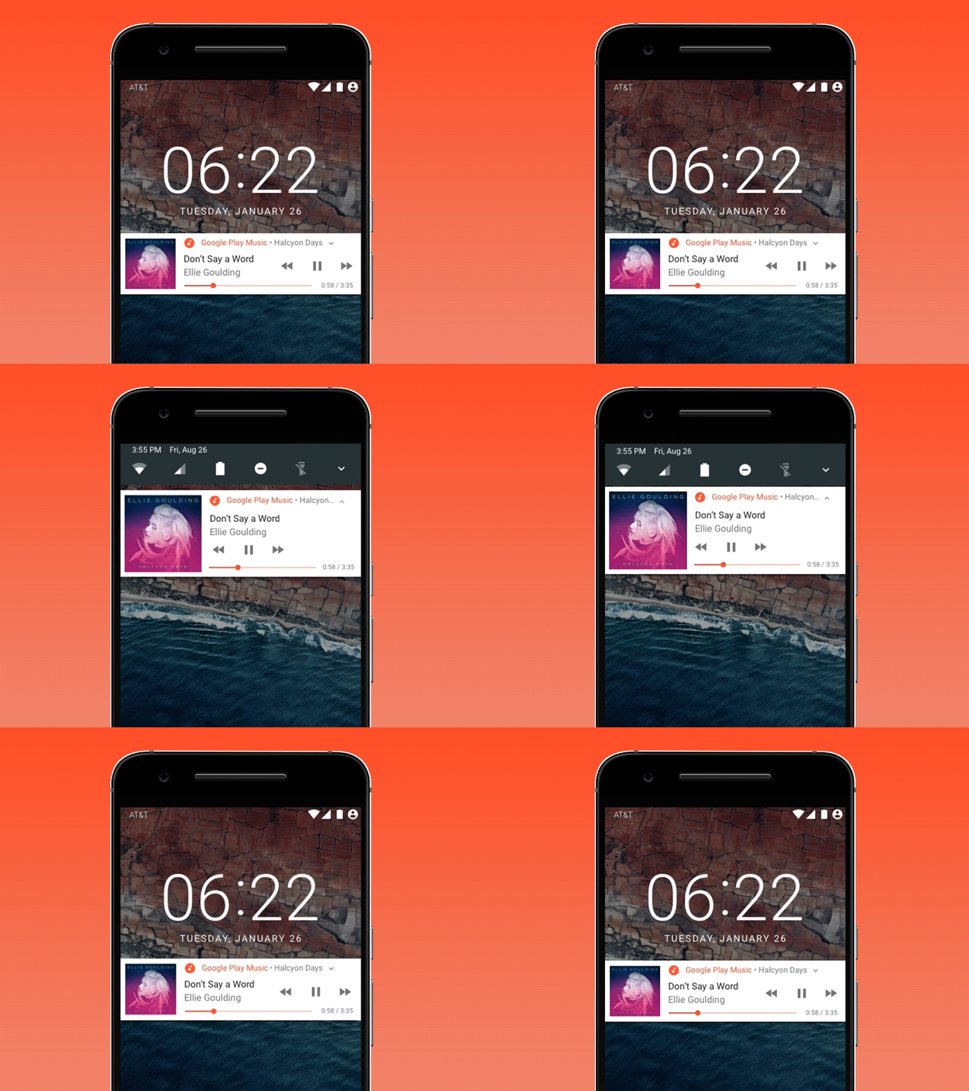
So in my first #MakeItBetter shot, I propose a small change this type of functionality could be added into Google's existing design system.
The pieces are already there. All that I would really like to see, and what I'm showing, is the ability to see the timestamp on whatever is playing. I included a scrubber, though its functionality may not be that useful in an actual use case. It could also be less of a scrubber and more of a visual way to represent progress in whatever you're listening to.
I started by using Google's Nougat notification system as a base to mock up the proposed improvements. Though, I've switched the location of where they display the album art to the left instead of the right. I also had to sacrifice the thumbs up and thumbs down functionality on the expanded view to the design gods in order to make the new elements fit.
I had a version of this that's more faithful the the existing Nougat design but I don't think it works as well.
Anyone else annoyed by not having a time stamp/progress bar? Anything I missed?
Thanks to @Ramotion for starting this exercise. It gave me the push to finally mock this up.
Here's a link to my Sketch and .prd files for anyone who's interested: https://www.dropbox.com/sh/sabjui8adodohxw/AACcGal-U8atDCJBJxZVHN-Ya?dl=0
