Expedia Website Redesign


If you see, every popular travel, air booking, or travel guide website designs are not as good as they should be (except Lonely Planet and few others). No doubt all they have very good UX, but they are very poor in visual. So I tried to redesign Expedia website. I kept their original contents, all their features and tried to give it a nice looking with better UX than they have.
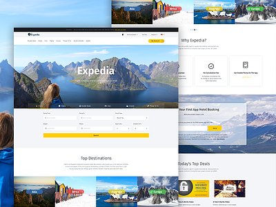
Expedias original design shows the booking form in the top slider/banner. So I made 2 version of homepage, one has the form underneath the banner, and another is just like Expedia.
I eagerly wait for your comment. Give me your opinion on this design.