Tellius - Chart Creation Process
Hi guys,
A bit of a blast from the past (2015/2016).
As mentioned before, this is Tellius. What is tellius? Basically, Tellius is a big data management web app. Or just to copy some text they use: "Tellius offers predictive analytics and operational intelligence by leveraging big data technologies and advanced machine learning algorithms on a single, data-agnostic platform. " :)
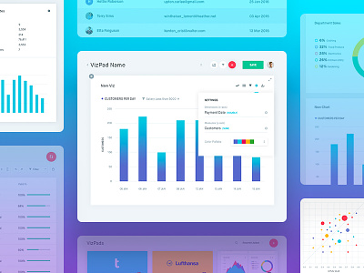
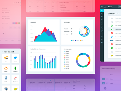
In the attachment, you have 5 images showcasing how a user can create his on "vizpad" which is basically a library of charts that showcase any type of data that is connected to it. So if you want to create a project detailing ticket prices for Airline companies and would love to show that using charts for presentation purposes, this is how you would do it.
1. Select an existing "vizpad" or create a new one. As mentioned before vizpads are collections of big data showcased with some visual aid in the form of charts.
2. Create a "Viz" - "Viz" is basically a chart. So in this pop up you select which data will populate this chart and select how will this chart actually look. You can choose from multiple types of charts.
3. Edit your "Viz" - You can always edit your viz/chart if you want, you can share it with other users, you can save it to your "viz library" and use it in other projects/vizpads.
4. Drill into a Viz - You can drill into your viz/chart and go into further editing and data detailing if you want. The difference here is that if you are in a "vizpad/project" you can have multiple charts, but if you want to drill into one chart you can do so and it will be showcased as a sole chart on your screen. It is an extra step but offers less confusion in the long-run.
5. Vizpad Multiple Charts - As mentioned before, you can have multiple viz's/charts in a single vizpad/project. Visualizing data as you want.
Sorry for the long post, check the attach and hit the "L" if you like it.
Design by: @Filip Justić
Also tellius launched so go and check them out at: tellius.com


