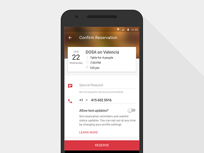
Android Booking Screen Update
The Booking Screen is where a user finalizes and makes a reservation. I noticed that this screen's forms were looking a little cluttered, as was the information its header. This update makes the page easier to understand and use. Also, the header now reflects the Restaurant Profile screen, which comes before this one, keeping the user in context and making the Reserve button more clear.
I used this page as a template for form styles that I've begun applying across the Android app. See the attachment for what it looked like before the update.
More by OpenTable Design View profile
Like

