Luminous Magazine
Hey everyone!
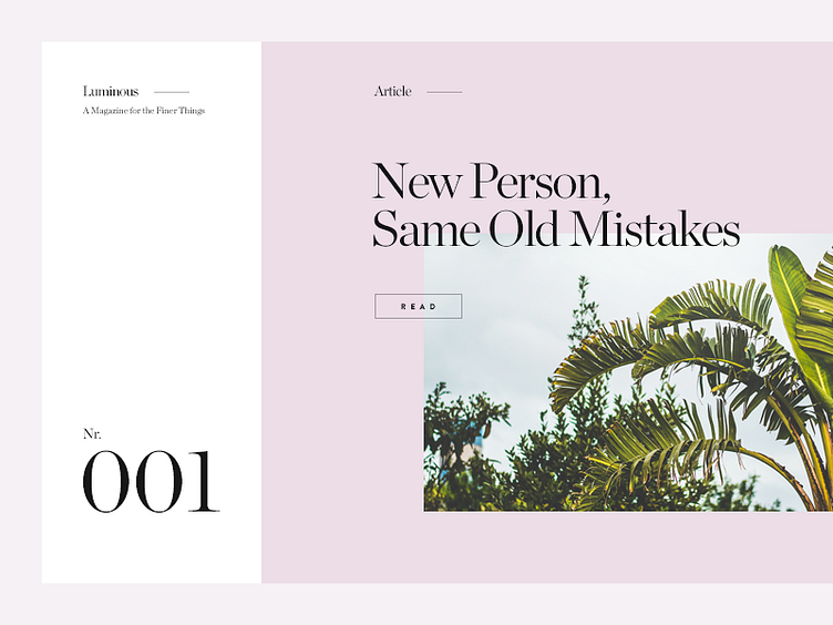
I started working on this design last week to explore some big colored surfaces I can combine with nice photography. I also wanted to see how big type would work for the number of the issue. I like the contrast between the white and the purple, but it also kinda reminds me of Pantone chips.