Fairwater
Check it out! http://bit.ly/2ddobJK
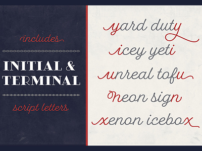
Fairwater’s aesthetic derives from three sources: the cursive handwriting styles popularized in the early to mid 1900s, the simplified, forgiving letterforms of tattoo lettering – and the pictorial themes that informed early-to-mid 20th-century naval tattoos. The Fairwater family includes three highly legible sans and script faces – friendly, monoline, and casual – in light, regular and bold weights. As with many of her faces, Laura can’t resist adding a plethora of swashes and alternates to the script version – 465 to be exact – for a total of 2,230 glyphs. Fairwater also includes four showier serif faces for use at display sizes, culminating in the the vaguely botanical “Sailor” and elegantly striped “Deco” weights.
Fairwater also includes a powerful decorative font entitled DIY Lines: 250 ornamental characters of ships, anchors, oars, knots, rope, botanicals, diamonds, arrows and more. With strokes and proportions that perfectly complement the type, DIY Lines expands the Fairwater family into a powerful design kit that evokes 20th-century craftsmanship, maritime themes, and colorful, salty personalities.
