WRNS S/S 17 key visual preview
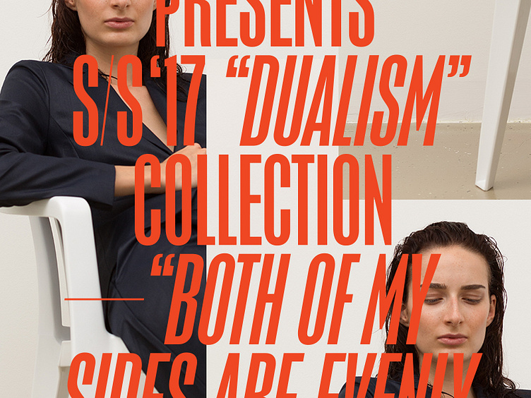
The font I used is modified Placard Condensed from Monotype, which I adjusted to even more condensed. I tweaked some details, that I felt like they didn't fit well with this setting, but I like that the typeface has some soft and very human details like the capital M or the curved R.
