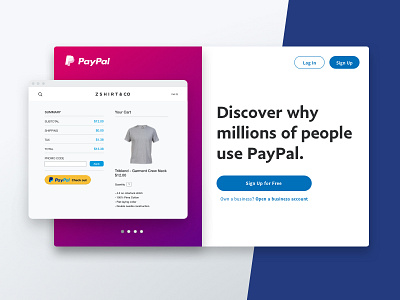
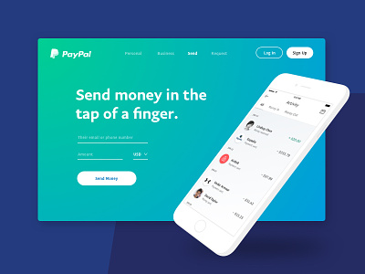
Product Card 3 - Discover PayPal
The final of my UI exploration trifecta, and definitely my favorite. I like the idea of having a fixed message mixed with a carousel of examples, as compared to the standard rotating hero carousel (yuck). Perhaps one day, an iteration of this may end up on our homepage.
More by PayPal View profile
Like

