netmag Design Challenge
Had the pleasure of taking part in July's Net Magazine Design Challenge along with two other designers.
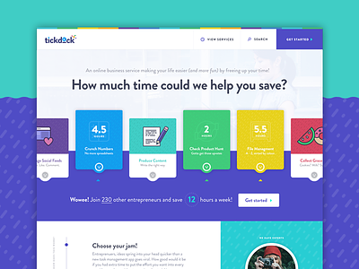
Under a super duper short timeline, I had to put together (a portion of) a website for a service that helped entrepreneurs/business owners with tasks they don't want to do/don't have the time to do. I chose the homepage, mostly for the visual potential. I'd love to flesh this out with a bit more consideration in the future!
Take a closer look at the @2x!
--------------------
Here's an excerpt from the challenge's rationale that was published in the magazine.
Tickdock is an online service outsourcing business services to entrepreneurs. Tickdock is a little quirky in nature so the services range from the ordinary… to the unusual, but ultimately all aim to relieve business owners of day-to-day stress. Tickdock recognises that their target audience’s main motivation to seek external help is to free up time for other things (or just for kicking back!) and as such, the site leverages this to drive much of its messaging.
Based on this, the site’s opening hero presents an immersive and interactive tool allowing visitors to immediately recognise how much time they could save per week. The services presented in this space would be those most commonly used by their user base with a few cheeky ones thrown in for brand kudos.
Below the main hero, the site will continue to explain the steps involved in using Tickdtock and feature some of its field experts or customers themselves. This, along with its friendly tone and provision of company statistics aim to build an element of trust.
--------------------
Kudos to Streamline Icons for the massive time saver!
