Portfolio Website Refresh
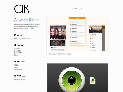
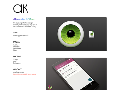
After some time with my new website I thought it's time for a refresh. Especially the old font Josefin Sans bothered me most. It's a nice catchy font, but not for long texts. I only kept it for my name.
As usual I've ended up making a kind of bigger refresh with some updated style and icons. Now also with a mobile friendly layout!
More by Alexander Käßner View profile
Like


