Interview & Location
Recently I was asked by a client to build a conceptual exercise before getting to next steps. It was mostly a visual exercise where most elements where meant to be aesthetically be presented.
Here's a brief I received:
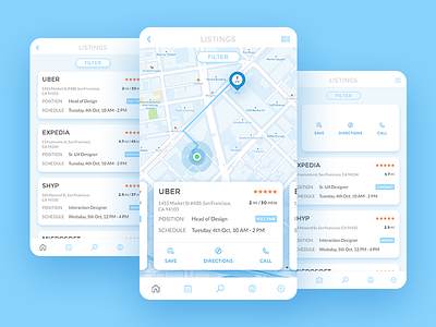
Design for an Interview Location Finder as a mobile app
Arrange the following information in the most aesthetic manner for one interview location. there can be multiple locations which the interviewees can browse through
1. Start time - text
2. End time - text
3. Date of interview - text
4. Name of the company - text
5. Interviewing for? (job type) - text
6. Location address - text
7. Location distance - text
8. Ratings for the company + stars + number of ratings
9. Estimated travel time from current location - text
10. Ability to call the interviewer - icon
11. Ability to get directions
Looking at all this info, the interviewee should be able to reach the location easily. Feel free to use maps, icons, labels, images wherever applicable.
Post this I sat down thinking should not be a mere 2-3 hours for one screen. But given the nature of how we should always think in some totality is what weighs me down to always try and create something meaningful, something which carries essence and solves for unseen cases. I have attached a simple process screens I usually do for such requirements to help myself put in user shoes and unearth potential needs which are usually not part of the briefs.
Here for example, ability to filter though, saving to calendar and a list view as well (for limited connectivity regions)as a reminder came out as potential reasonable asks from a user stand point.
So a few extra hours helped in an output I am happy to share now and felt slightly great about it. Always great to share one's own perspective here and get back more in return to see how you folks see it :).
CHEERS


