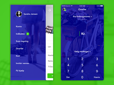
Nordea Mobile Concept – sidebar/transfer (3/3)
Although research shows that sidebars de facto hiding functionality which means it is less used. In this case I believe that the primary CTA is visible in main account and the rest is less important. Inbox etc is rarely used.
Transfer-screen is very much inspired by Danske Banks MobilePay with a account status added for overview.
NB: This is a concept and I am not associated with Nordea what so ever. As I work with Tradono, designs like these I'm doing once in a while for fun and to keep my design skills sharp.
More by Nicklas Pape View profile
Like
