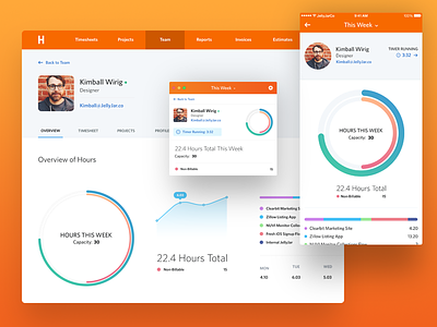
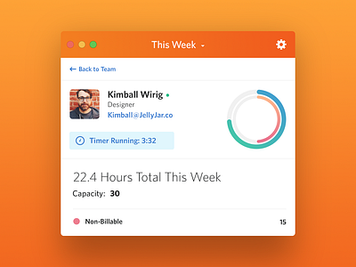
Harvest Team Profiles - Mobile, Desktop, Mac App
I know, I know. Another unsolicited redesign while “I was bored over the weekend”… But I actually like doing these from time to time just to keep practicing my design skills, work on something that has no time constraints and of course share my thoughts and work.
About a month ago Harvest shared a blog post describing that they had planned to give more insight into team members by offering an interface in their product that would bring to surface more details in regards to hours and budget per project in relation to the team. As I am a daily Harvest user and absolutely LOVE their service, of course this article got me excited!
As I looked at the designs and read the article, it cultivated some creativity in me to try my hand at the Harvest Team Profile views.
So, here it goes. A few things I would love to see as I dig in on one of my team members at JellyJar is a snap shot of their week, what they have going on and where we are as far as budget. I don’t view these things to be a slave driver (actually we have it pretty easy at JellyJar, just ask) but to more so understand where we need to focus attention and where we need to be aware of client budget and team member’s weekly capacity. I know Harvest can offer some of this now, but you have to dig and hunt to connect the dots. I think this would make it much easier. Their article does indeed highlight that much of this will be don’t, but still a few things missing that I would love to see.
I know the math in these design comps may not be accurate but I think you will get the gist of what I am trying to achieve here. Enjoy punching me in the face for my unsolicited redesign :)
Be sure to see the attachments to get a better view.


