Prairie Krafts Brewing Company Logo Option 5

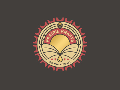
Another logo option for Prairie Krafts Brewing Company, a Chicago-based brewery with an Indian inspired twist.
The aim for this logo version was to capture an abstract idea of the pure and natural brewing process rooted through prairie land while introducing colors that evoke friendliness and warmth. One of the client's larger driving factors was brewing with purity and keeping a sustainable process. Tying into this idea, the golden drop represents PK's beer, being squeezed out of the prairie, represented by rolling hills and the sunset.The outer bottle cap pattern is reminiscent the design on the Indian flag while the four stars reflect the design of the Chicago flag.