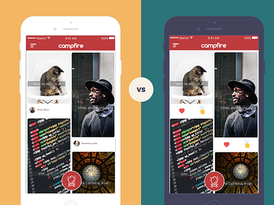
Campfire Home Styles
Caught up in a clash between the two designs for the homepage. The first one is keeping an uber clean and crisp layout using focusing just on the Memories being shared and a picture of the OP. Whereas the second layout adds two prime actions of Liking a memory or sending a Knock Knock (request to comment on a memory) in a visible icon format which has been removed in first style. What caught me up is which layout is better in terms of everything like aesthetics, functionality. What do you think looks better and how can it be improved?
Cheers!
Aman
More by Aman Tiwari View profile
Like
