The Wall


In the late 90s, I made my parents proud, moved to San Francisco and became a bike messenger. This publication is a nod to that period of my life.
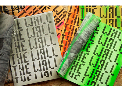
In downtown SF there is a spot where the messengers hang out and wait for their next job, it is referred to as ‘THE WALL’. I used this as the title and then designed the publication so that it would be extremely low cost to produce. Each issue,has one color introduced in the form of spray paint. The actual grid is based on the few blocks surrounding the area of the wall and the wall itself. Designed The display face, titled Leftovers, used for the wall Logo and headers throughout