eeebook
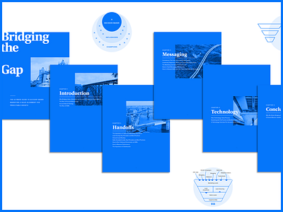
Ebooks might not be the most exciting thing to design but this project gave me a new level of respect for actual book designers. I hate myself a little bit for using "that blue" but the theme was "Bridging the Gap" so it made sense to give it an architecture/blueprint feel.
More by Steven Striegel View profile
Like

