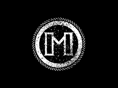
The Letter M
Decided to go with a more logo/stamp/monogram style on this one rather than the more illustrative ones i've done for the last few.
May have overdone it a little with the texture. oops.
More by Aaron Tenbuuren View profile
Like

