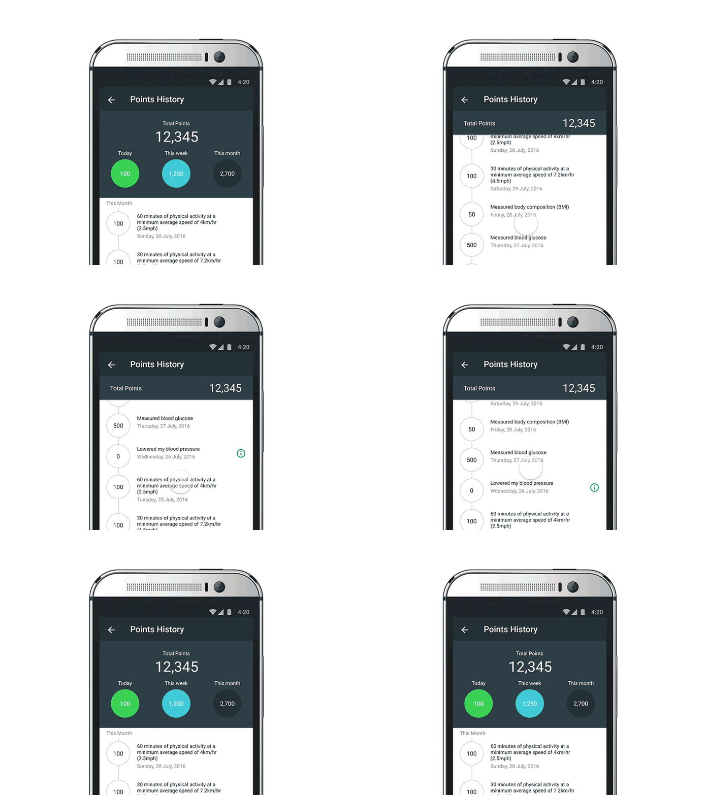
Material Statement List (Framer download link attached)
This is a concept I made for AIA Vitality Australia, a reward program for AIA’s insurance customers.
Designing Android app made me wonder what would be the most delightful visual experience. I found the hint from scrolling the screen.
No bouncing, no gravity even if you pull the scroll all the way up or down on Android. It felt different, it felt like a pulley! So why not make the screen feels like pulling a rope? :)
Framer link http://share.framerjs.com/yfh1zmf5yawj/ (Looks & Works best on desktop browsers.)
More by Jinju Hopkins View profile
Like
