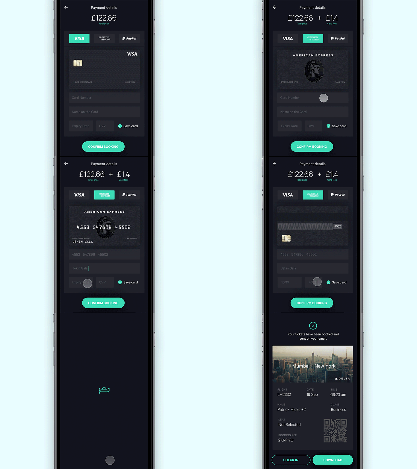
Payment for flight app
Payment screen for the flight app concept I am working on. The main idea behind designing this screen was to show the users their credit cards in a visual way. This reassures the user that the card type input matches the card they are holding in their hand. I believe this would enhance the payment experience and reduce the errors to a great extent.
View the screens here
Inspired by this dope shot
Follow me : Behance
More by Jekin Gala View profile
Like


