Dashboard Navigation

This is the seller dashboard nav redesign I was working on towards the end of the time at ThreadMeUp.
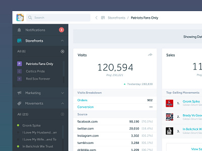
In this design, I was trying to make sub-nav elements more readily available for our customers. To do this, I made sub-nav elements like individual movements and storefronts visible at all times—this prevents users from having to go to the nav item (movements and storefronts, respectively) and then browsing page for what they were looking for.
I did the same thing for creating new items. For every element in the nav the had a CTA, I made a shortcut (+) so they could get started no matter where they were at in the dashboard.