Travel Site — Design Exploration


Fun exercise exploring a design for a travel site. Check out the moodboard that influenced this.
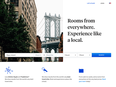
The shot is the latest rev but I dig this earlier rev too. The cropped circle does make the top area a wee bit off balance though, and the white type is hard to read.
Played around with Tiempos Headline and Akkurat as a font pair, as inspired by @Intercom's blog ;)