S Heart Mark
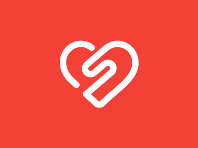

Logo design submission for a project I've been working on for a women's fitness studio.
Short rationale is: 'S' is the lead initial of the company and heart shape represents health & fitness. The soft rounded lines help give a more feminine feel coupled with a vibrant but slightly pastel colour palette.
I've included some variations of the mark in the attachments, let me know which would be your winner :)