Account Info
Hey all,
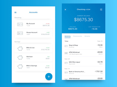
These are a few more screens for my new site of a redesign of my current banking app.
I'm sure like many of you I use my phone to check my account balance all the time, but the information that's presented and how it's presented is unfocused and cluttered.
These two screens are just a couple for the upcoming case study, and represent how I'd handle displaying accounts and account info.
Hit me with any thoughts, and press "L" if you like.
Thanks for looking!
** Icon Credit
Karthik Aathis
KΛPKLΛM
More by Mike DelGuidice View profile
Like


