New Logo Exploration
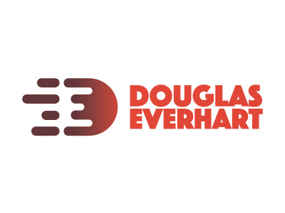
So I took a drastic turn with my logo and really pushed to find a way to combine the letters E and D together. I appreciate any thoughts and input! I've moved away from cool receding colors to something that stands out more and matches me more.
More by Douglas Everhart View profile
Like
