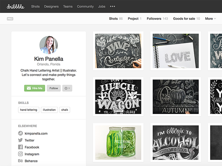
Profiles with a side of information
Today, you may have noticed some changes to profile pages here at Dribbble. As the the community has grown and evolved, we've been showing more and more interesting information about our members. With our previous, single-column design, retrofitting additional information resulted in pushing the work further down the page, so we limited what we displayed by default and hid some other info behind menus. The new, two-column layout easily allows us to show much more about the designer: URLs to other sites, skills, projects, whether they've been featured in our blog or podcast, etc.
Additionally, we like keeping the designers' info and actions (Hire Me, Follow, etc.) all together in a single space. All of these improvements also work much better across various devices and viewport widths than they did previously.
We hope you dig the new profile layout and also hope it helps folks find out more about and connect with all the great designers in the community.
