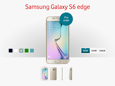
Phone details / plan selector page
I was assigned as a journey manager for bill pay at the start of 2015, and from reviewing the data available at this step a problem was isolated. It was noticed that customers were going back to the gallery a lot from this step. What was happening was the phones were listed separately for memory and colour, so the new design combined them into one listing. By fixing this we reduced the friction point and gained more traffic further down the conversation funnel.
Redesign for Vodafone.ie phone details page included rich content via reviews, videos and imagery. New icons were also created for the features of the top handsets and a new style guide for the CTAs throughout the flow.
More by Gareth View profile
Like

