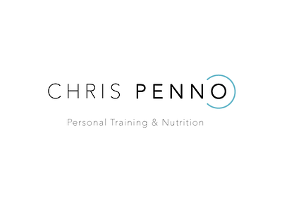
Chris Penno PT Identity
Chris approached me for a simple website and identity that would attract both women and men. I went for this minimal typeface along with a turquoise colour - which has a sporty feel. To make the logo more original, I decided to create the "O" into a dumbbell.
See the website here: www.cpennopt.com
Follow me on:
Behance | Instagram | Twitter
All Works Copyright © 2016 Alan Danby
More by Alan Danby View profile
Like
