Day 28 - Search Results
Hey there,
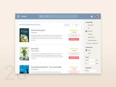
Today's design is a search results page.
I'd like to highlight some interesting design solutions:
1. Filters are always visible on the right.
2. The search box is not inside the filtering options, because I think there are two different use cases:
- people either want to browse books (they don't know the exact title/author), so they use filters
- or they want to find a specific book (or books) by title/author and they use the search box
With this arrangement these two options are a bit more separated and it's easier to find the search box if it's in the header.
3. Though it's supposed to be a desktop application I used a hamburger menu and a sidebar for navigation.
4. Prices are on the primary call-to-action buttons.
What do you think about these design decisions? Could they work in real life with real users?
I hope to get some feedback on this.
Best,
Zsolt
You can check my previous works on my Behance profile.

