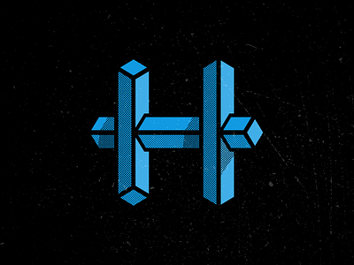
The Letter H
#08 - the letter H
Sketched this out with a very Escher-y feel to it, with each bar being "broken" or "wrong", and when it finally came to putting it in Illustrator I just couldn't get it wrong enough. It looked more like minor mistakes than a intentionally wrong design, so I dialed it back a bit and came to this instead.
I dig it, it feels a little logo-y which I'm cool with.
More by Aaron Tenbuuren View profile
Like

