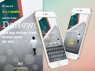
Concept of Sign up | in process
Hi!
I am joining the Daily UI challenge 🕶
Since as a designer I am more into UX than into UI, I prefer to add more UX in the task.
_
This is my first work - the concept of sign up/sign process for an app. I think that most of the apps we have in the app markets today are not human-friendly enough. And the moment of the first look when we launch an app is probably the most important in this aspect for the good UX.
The main steps and ideas are:
- Interface is a dialogue between friends, not a machine and a user.
- We combine sign in and sign up in one conversation-like process.
- In addition to this mix we insert onboard screens, where we introduce main features of our app.
I will make a video of the whole process and put it in the next post 📽
Press Like 💟 if you have found this post good, funny or just interesting :-)
Many thanks to @Nick Parker for invite ;-)
