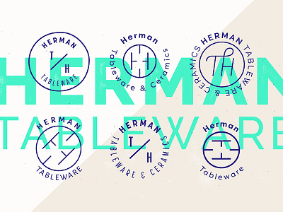
Herman Tableware & Ceramics
Working on a logo for a potter/ceramicist. H is killing me, but kind of cool to be able to combine TH initials using negative space which makes it readable (if you must read it) whichever way you turn it—inspired by the potter's wheel. But a little bit too many Hs in my work lately, craving for nicer looking letters!
More by Attitude View profile
Like
