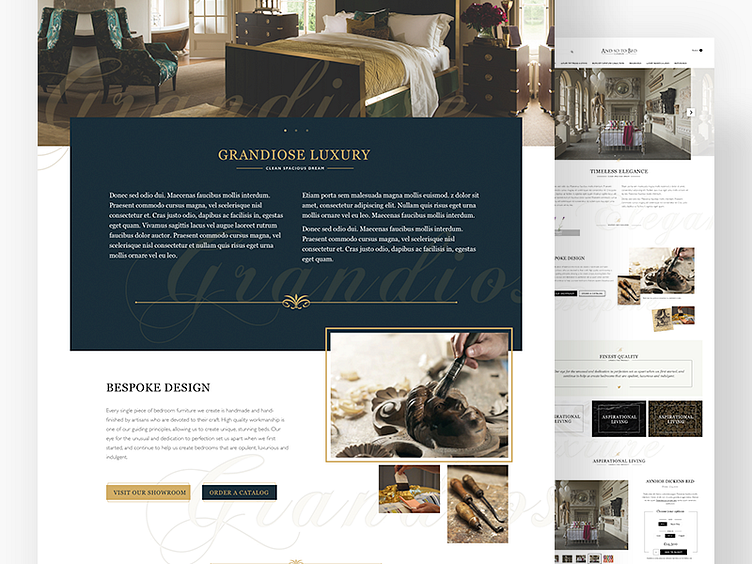
And So To Bed 'Style Comps'
During this project we tried something a little different in the early stages. Usually we'd create moodboards then start working on style tiles before creating page comps. However we know the client wanted to see how elements of a page would look. So we created these 'style comps' as we named them. They take elements of an ecom site and they all live together on one page. We explained to the client what to expect and they went down really well. We then went back a step after the client had chosen a direction to refine elements before designing the full pages.
The benefits were seeing how a lot of elements would work together very quickly and early into the project.
The drawbacks we're show clients elements that hadn't been fully refined and possibly wouldn't work for them when we carried out more research on their requirements and product details.
We think that as long as you educate the client the later shouldn't been a show stopper.
